Monday, 23 April 2012
Combination of main task and ancillary tasks

 Overall my ancillary tasks and main task link really well. The theme is clearly represented through the newspaper advert, double page magazine spread and main task. I kept the colour scheme of red, yellow and white through out as it represents typical fast food restaurant colours. Even for our documentary we used white text. For both ancillary tasks I used the same font to show that they are linked and show they are advertising the same documentary. The images of the fast food in both ancillary tasks are the same objects that we used in our documentary. In the documentary we incorporated different fast food, mainly from McDonalds. We then photographed them and used them in our ancillary tasks. I also incorporated dialogue from our documentary in to the ancillary tasks, which were mainly facts on fast food. This gives the viewers an insight in to what is in the documentary. Also in the double page magazine spread we incorporated a section of the interview with Debra Brown from our documentary, which again gives viewers an insight in to the documentary.
 Audience Feedback
We asked a variety of people to watch our documentary and give their feedback and opinions on it. The audience feedback is really important as it allows us to see the most successful parts of our documentary and parts we could have improved on.
Improvements which the audience suggested:
Overall we were really happy with the feedback given to us by the audience. The successful feedback is all the factors we were trying to cover through our documentary, including making it engaging and informative. The improvements suggested have helped us realise mistakes we could have improved on.
Improvements which the audience suggested:
- 'Compare more kids meals from different restaurants' - We could have looked at the children's meals from other popular fast food chains like KFC, Pizza Hut, etc.
- 'Could have had shots of children eating fast food in restaurants' - This is something we tried to capture, however due to legal reasons we were unable to film inside a fast food restaurant.
- 'One of the scenes had background noise from a van, so you could'nt hear the voices as well' - Unfortunately we were filming in a busy town as this is where the fast food chains were located, so we had background noise from vehicles and pedestrian's.
- 'More variety with the archive footage' - We could have included other archive footage instead of it all being quite similar.
- 'All the music related to what you were talking about'
- 'Some humorous music, makes it more light-hearted'
- 'Engaging, and you could enjoy what you were watching'
- 'Interesting'
- 'Very informative and interesting'
- 'You (documentary makers) were in quite a few scenes which made it more engaging'
- 'Music was really good as it was to do with the topic'
- 'Statistics were used which made it suitable for adults and parents'
- 'Aimed for older audience and parents'
Overall we were really happy with the feedback given to us by the audience. The successful feedback is all the factors we were trying to cover through our documentary, including making it engaging and informative. The improvements suggested have helped us realise mistakes we could have improved on.

Editing
For the editing process we used imovie on an Apple Macbook as it is simple to use and it has a variety of different ways to edit a movie, using transitions, text, images and music. Although we worked well on imovie, it did not allow us to create a split screen which is something we were originally planning on doing.
Music:
.jpg) For our documentary we tried to to find music which related well to our theme. We used Youtube to find the music for our documentary. We chose the 'Fast Food Song' to go at the beginning of our documentary so it was clear to the audience the theme of the documentary, we then used another part of this song half way through our documentary. It is quite humorous so gives a slight light-hearted effect to the documentary. We used a song from the film 'Oliver Twist', called 'Food, Glorious Food', at the end of our documentary before the advert break would start. We thought these two choices of songs work well with our documentary as they both include lyrics about food. We used two other instrumental songs including 'Shelter' and 'Skinny Love' by Birdy, which we used while filming people walking in and out of the fast food restaurant and when we looked inside the childrens Mcdonald's Happy Meal.
For our documentary we tried to to find music which related well to our theme. We used Youtube to find the music for our documentary. We chose the 'Fast Food Song' to go at the beginning of our documentary so it was clear to the audience the theme of the documentary, we then used another part of this song half way through our documentary. It is quite humorous so gives a slight light-hearted effect to the documentary. We used a song from the film 'Oliver Twist', called 'Food, Glorious Food', at the end of our documentary before the advert break would start. We thought these two choices of songs work well with our documentary as they both include lyrics about food. We used two other instrumental songs including 'Shelter' and 'Skinny Love' by Birdy, which we used while filming people walking in and out of the fast food restaurant and when we looked inside the childrens Mcdonald's Happy Meal.
Transitions:
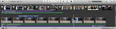
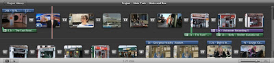.jpg) We used a variety of transitions throughout our documentary including fades, wipes and dissolves. The transitions allowed our documentary to run smoothly. This is a screen shot of our documentary during the editing process, showing all the transitions we included.
We used a variety of transitions throughout our documentary including fades, wipes and dissolves. The transitions allowed our documentary to run smoothly. This is a screen shot of our documentary during the editing process, showing all the transitions we included.
Voiceovers:
In our documentary we used two main voiceovers, both 'voice of God'.
Text:
.jpg)
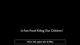.jpg) We used text at the beginning of our documentary which includes the title. We made it so it would scroll upwards with the screen as we thought this created an exciting effect. We also used text at the bottom of the screen when we were doing interviews, to show the interviewee's name and occupation. While the people were walking in and out of the fast food restaurant we put facts on the screen so the visuals match the voiceover. Again we used the scrolling effect on a question which we put around half way in to our documentary, we also used text which came on from the sides, to almost answer the question. We then used white text for the title again at the end of our documentary. All the text we used throughout our documentary was white as we wanted to keep the colour scheme consistent throughout, also it stands out well.
We used text at the beginning of our documentary which includes the title. We made it so it would scroll upwards with the screen as we thought this created an exciting effect. We also used text at the bottom of the screen when we were doing interviews, to show the interviewee's name and occupation. While the people were walking in and out of the fast food restaurant we put facts on the screen so the visuals match the voiceover. Again we used the scrolling effect on a question which we put around half way in to our documentary, we also used text which came on from the sides, to almost answer the question. We then used white text for the title again at the end of our documentary. All the text we used throughout our documentary was white as we wanted to keep the colour scheme consistent throughout, also it stands out well.
Music:
.jpg) For our documentary we tried to to find music which related well to our theme. We used Youtube to find the music for our documentary. We chose the 'Fast Food Song' to go at the beginning of our documentary so it was clear to the audience the theme of the documentary, we then used another part of this song half way through our documentary. It is quite humorous so gives a slight light-hearted effect to the documentary. We used a song from the film 'Oliver Twist', called 'Food, Glorious Food', at the end of our documentary before the advert break would start. We thought these two choices of songs work well with our documentary as they both include lyrics about food. We used two other instrumental songs including 'Shelter' and 'Skinny Love' by Birdy, which we used while filming people walking in and out of the fast food restaurant and when we looked inside the childrens Mcdonald's Happy Meal.
For our documentary we tried to to find music which related well to our theme. We used Youtube to find the music for our documentary. We chose the 'Fast Food Song' to go at the beginning of our documentary so it was clear to the audience the theme of the documentary, we then used another part of this song half way through our documentary. It is quite humorous so gives a slight light-hearted effect to the documentary. We used a song from the film 'Oliver Twist', called 'Food, Glorious Food', at the end of our documentary before the advert break would start. We thought these two choices of songs work well with our documentary as they both include lyrics about food. We used two other instrumental songs including 'Shelter' and 'Skinny Love' by Birdy, which we used while filming people walking in and out of the fast food restaurant and when we looked inside the childrens Mcdonald's Happy Meal. Transitions:
.jpg) We used a variety of transitions throughout our documentary including fades, wipes and dissolves. The transitions allowed our documentary to run smoothly. This is a screen shot of our documentary during the editing process, showing all the transitions we included.
We used a variety of transitions throughout our documentary including fades, wipes and dissolves. The transitions allowed our documentary to run smoothly. This is a screen shot of our documentary during the editing process, showing all the transitions we included. Voiceovers:
.jpg) |
| This voiceover was over the top of the scenes where the people are walking in and out of the restaurant. It invloves one of the documentary makers talking about fast food and obesity facts. |
 |
| This voiceover is placed over the top of the images of fast food chains. The documentary maker spoke about how there is lots of fast food chains available and the impact its having. The voices relate to the visuals. |
Text:
.jpg)
.jpg) We used text at the beginning of our documentary which includes the title. We made it so it would scroll upwards with the screen as we thought this created an exciting effect. We also used text at the bottom of the screen when we were doing interviews, to show the interviewee's name and occupation. While the people were walking in and out of the fast food restaurant we put facts on the screen so the visuals match the voiceover. Again we used the scrolling effect on a question which we put around half way in to our documentary, we also used text which came on from the sides, to almost answer the question. We then used white text for the title again at the end of our documentary. All the text we used throughout our documentary was white as we wanted to keep the colour scheme consistent throughout, also it stands out well.
We used text at the beginning of our documentary which includes the title. We made it so it would scroll upwards with the screen as we thought this created an exciting effect. We also used text at the bottom of the screen when we were doing interviews, to show the interviewee's name and occupation. While the people were walking in and out of the fast food restaurant we put facts on the screen so the visuals match the voiceover. Again we used the scrolling effect on a question which we put around half way in to our documentary, we also used text which came on from the sides, to almost answer the question. We then used white text for the title again at the end of our documentary. All the text we used throughout our documentary was white as we wanted to keep the colour scheme consistent throughout, also it stands out well.
Wednesday, 11 April 2012
Scripting
 |
| Thes are the facts we read out during the voiceover which played over the top of the people walking in and out of the fast food restaurant. We collected these facts from health websites and news websites. |
 |
| These are the questions we asked Debra Brown during the interview. |
 |
| This is the script for the voiceover which we played over the top of the shots of the fast food restaurants. |
Mise en Scene - Costumes
 |
| Scene with the children in school uniform, in the background. |
 |
| Archive footage with news reporter |
Mise en Scene - Lighting

In our documentary the scenes outside incorporate only natural lighting from the sunlight. Whereas the scenes we filmed inside use artificial lighting from ceiling lights. However we didn't add any other lighting as we wanted it to be quite natural as it is a documentary.

Thursday, 5 April 2012
Mise en Scene - Acting
.jpg)
As our documentary fits in to conventions of an expository and participatory documentary, as the documentary makers we decided to be very much involved and on screen for a large amount of time, to make it an interactive and engaging documentary. Having a lot of screen time, as the documentary makers, makes our documentary very much conventional of a participatory documentary. We directly address the audience with this technique, making it more engaging and interactive.
.jpg)

.jpg)
Mise en Scene - Make-up
.jpg)
The make up in our documentary is natural. Natural make up is usually conventional of a documentary as they consist of real life interviews and show real events or situations happening, nothing is usually made up like a film would be.
Mise en Scene - Props


This is a toy from a childs fast food takeaway meal. We used it in the scene after the archive footage at the beginning of our documentary. Where the documentary maker (myself) catches it while walking towards the camera.
Mise en Scene - Setting
)


Wednesday, 4 April 2012
Target Audience

Final Storyboard For Our Documentary


This is a storyboard for our final documentary. We have made many changes and improvements from our original storyboard throughout this process.
Scenes we kept the same:
- Shots of fast food restaurants flashing up one after the other. Voiceover - voice of God.
- Buying fast food from Mcdonalds restaurant.
- Interview with documentary maker and interviewee on screen.
Scenes we changed:
- We were going to do a split screen, however we were unable to do this with the software we were using.
- We were going to film inside a fast food restaurant but unfortunately we were unable to film in any fast food restaurant due to legal reasons.
Tuesday, 3 April 2012
Ancillary Task - Final Double Page Magazine Spread

This is our final double page magazine spread for our documentary.
We included:
- Columns - to make it clear for the readers, it is also very conventional of magazine spreads.
- We embedded text in to an image of chips to break up the text a bit and to make it more visually interesting and unique.
- Once again we kept the yellow and red colour scheme to represent the fast food theme.
- We incorporated facts along the side of the magazine spread to shock people with the true facts on fast food and obesity, making people want to find out more.
- We incorporated images of fast food falling out of a childrens fast food take-away box, which we photographed ourselves.
Ancillary Task - Idea for double page magazine spread

This was our first idea for our double page magazine spread. We liked the idea of embedding the text in to the image of the burger as this would make it more interesting and unique. However for our final double page spread, we decided not to use this idea as we couldnt fit all the text we needed in this small space.
Once again we decided to keep to the colour scheme of red and yellow, to represent fast food restaurants.
A problem with this first idea was that there is only one relevant image incorporated and we thought we needed more images to improve it. Also it almost looks like a poster not a magazine spread so we decided to change it for our final one.
Monday, 2 April 2012
Ancillary Task - Final Newspaper Advertisement

This is my final newspaper advertisement for our documentary.
I included:
- A rhetorical question at the top of the page to engage the audience and let them know what the documentary will explore.
- Three relevant images which I took of fast food - visual representation of the subject.
- A fact from the documentary in the corner - to shock the audience, making them want to find out more about the subject.
- I chose a red, yellow and white colour scheme as this represents fast food restaurants.
- I embedded the title in to the burger to make the advert more visually attractive and interesting.
- I also wrote when and where the documentary will be aired.
Wednesday, 22 February 2012
Tuesday, 21 February 2012
Ancillary Task - Newspaper Advert
For the second part of the ancillary tasks we must work individually and I have chosen to create the newspaper advert.
These are some examples of newspaper adverts:

This is an advert for a musical, similar to what I need to create for my film advert. I like how the image fills the advert as it is eye catching and shows the viewers the main characters involved. The font used for the title is very eye catching and unique as it links to the theme by making it look eerie and ghostly.
All the information about the musical is at the bottom of the advert which is easy to see and makes the layout clear and neat. Although there is one large image in this advert, to improve it I would add another image to help show the viewers more about what the musical is about.

This is a newspaper advert for a bingo site. Once again there is one large image which is relevant to what the advert is trying to advertise. The title is very bold and clear to read, however its quite simple and plain. The colours involved are also quite simple and plain as it mainly involves black and white colours, so more vibrant colours and images would make this advert more eye catching and interesting to look at.

This is an advert by the NHS about germs. Once again this advert involves one large image which gets straight to the point and shows the viewer simply what the advert is about. Also it is quite a shocking image which makes it eye catching. The details for the advert are in a small box at the bottom of the page which makes it clear and easy for people to read. However to improve it I think making the plain font more unique will make this advert stand out better.
Monday, 6 February 2012
Our documentary so far...
Locations:
For our final, documentary film we have been filming in a variety of places which link to our documentary topic. We have filmed in a kitchen of a house, in Walton highstreet and in a fast food restaurant. We have yet to film a doctor or health expert in a suitable location, for example a doctors surgery.
Interviews:
We have interviewed a few students and teachers asking questions about their favourite fast food and fast food restaurants which we have included in to our final film. We are also planning on trying to find a doctor or dietitian which will allow us to ask questions on the impact fast food is having on peoples health, as we think having facts from a doctor or dietitian will shock people who watch it and will show them the thruth and severity of eating fast food, which is what we are trying to achieve in our documentary.
Actors:
 We are currently working on the editing of our documentary through 'imovie'. We are trying to work out the best ordering for each section of the film before adding the music and speeding up/ slowing down sections, aswell as adding in transitions, etc. We also have to collect some archive footage to put in to our documentary. We are planning on getting news reports on child obesity and fast food. We also need to do a few voiceovers to help make the film more fluent and incorporate impotant facts on the topic.
Target Audience:
The target audience for our documentary is parents as we believe that they should see the impact fast food is having on the health of their children. We also think if older children/teenagers watched our documentary it would also help them realise the health risks of eating too much fast food. Being a participatory documentary helps us target teenagers as we (the documentary makers) are involved in the film, making it more engaging for the viewers and its more interactive. When we edit our film we need to make sure it targets both parents and teenagers, by making it engaging and exciting by using voiceovers and different transitions between shots.
For our final, documentary film we have been filming in a variety of places which link to our documentary topic. We have filmed in a kitchen of a house, in Walton highstreet and in a fast food restaurant. We have yet to film a doctor or health expert in a suitable location, for example a doctors surgery.
Interviews:
We have interviewed a few students and teachers asking questions about their favourite fast food and fast food restaurants which we have included in to our final film. We are also planning on trying to find a doctor or dietitian which will allow us to ask questions on the impact fast food is having on peoples health, as we think having facts from a doctor or dietitian will shock people who watch it and will show them the thruth and severity of eating fast food, which is what we are trying to achieve in our documentary.
Actors:
As our documentary is participatory, we are very much involved in our film. However we do have a few actors, including students and teachers as we interviewed them on the topic. We also still need to film a doctor or health specialist.
Editing:
 We are currently working on the editing of our documentary through 'imovie'. We are trying to work out the best ordering for each section of the film before adding the music and speeding up/ slowing down sections, aswell as adding in transitions, etc. We also have to collect some archive footage to put in to our documentary. We are planning on getting news reports on child obesity and fast food. We also need to do a few voiceovers to help make the film more fluent and incorporate impotant facts on the topic.
 Target Audience:
The target audience for our documentary is parents as we believe that they should see the impact fast food is having on the health of their children. We also think if older children/teenagers watched our documentary it would also help them realise the health risks of eating too much fast food. Being a participatory documentary helps us target teenagers as we (the documentary makers) are involved in the film, making it more engaging for the viewers and its more interactive. When we edit our film we need to make sure it targets both parents and teenagers, by making it engaging and exciting by using voiceovers and different transitions between shots.
Monday, 30 January 2012
Listings Magazine
As a group we will be making a double page spread for a listings magazine, for our ancillary task.
Examples of double page spreads:
 The title on this double page spread is in large, bold text which is quite unique so makes it stand out.
 - There is one large, appropriate image on the right hand side which attracts the viewers attention and instantly lets the viewers know who the article is about.
- The text is divided in to columns - easy to read.
- However it is quite a simple layout and lacks creativity and I.T techniques.
- Also a few more smaller images would make it better.

 The title is large and bold which makes it eye catching, however the font is quite simple/plain.
 - There is a small summary under the title in a slightly larger font to the rest of the text, which will make people read that first.
- Theres a large image which engages the viewers and instantly shows the viewer what the article is about. It is merged in with the text which makes it more interesting to look at.
- There is a good amount of appropriate images included.
- The text is put in to columns which makes it easier to read.
- There is a small fact box along the side which makes it simple to read and get the information faster.

 One large image covers the double page which makes the layout more eye catching and interesting.
- The title is in two different fonts which emphasises the word 'Blood'.
- There is a quote from the programme in the top right hand corner.
- Two columns of text is incorporated with a small image merged within the text.
- In the bottom right hand corner there are charcter profiles in a small box which also incorporates images, this gives viewers instant facts or information on the characters.
- There is a good amount of appropriate images included which are all different sizes.

Tuesday, 24 January 2012
Outtakes For Final Film
These are all the mistakes which we made while making our final documentary. We put them together to create a small, humorous video.
Tuesday, 17 January 2012
Listings Magazine Powerpoint
Listings magazine - ancillary task
View more presentations from ruff123.
As a group we are making a double page spread in a listings magazine for our ancillary task. This is a powerpoint of what we will include on our double page spread and other examples of listings magazines.
As a group we are making a double page spread in a listings magazine for our ancillary task. This is a powerpoint of what we will include on our double page spread and other examples of listings magazines.
Subscribe to:
Posts (Atom)